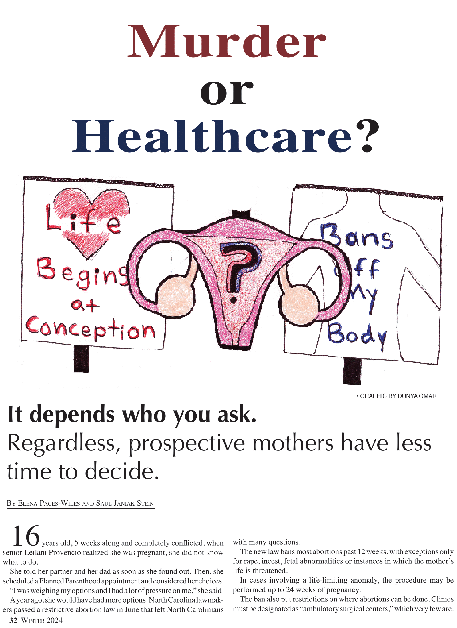
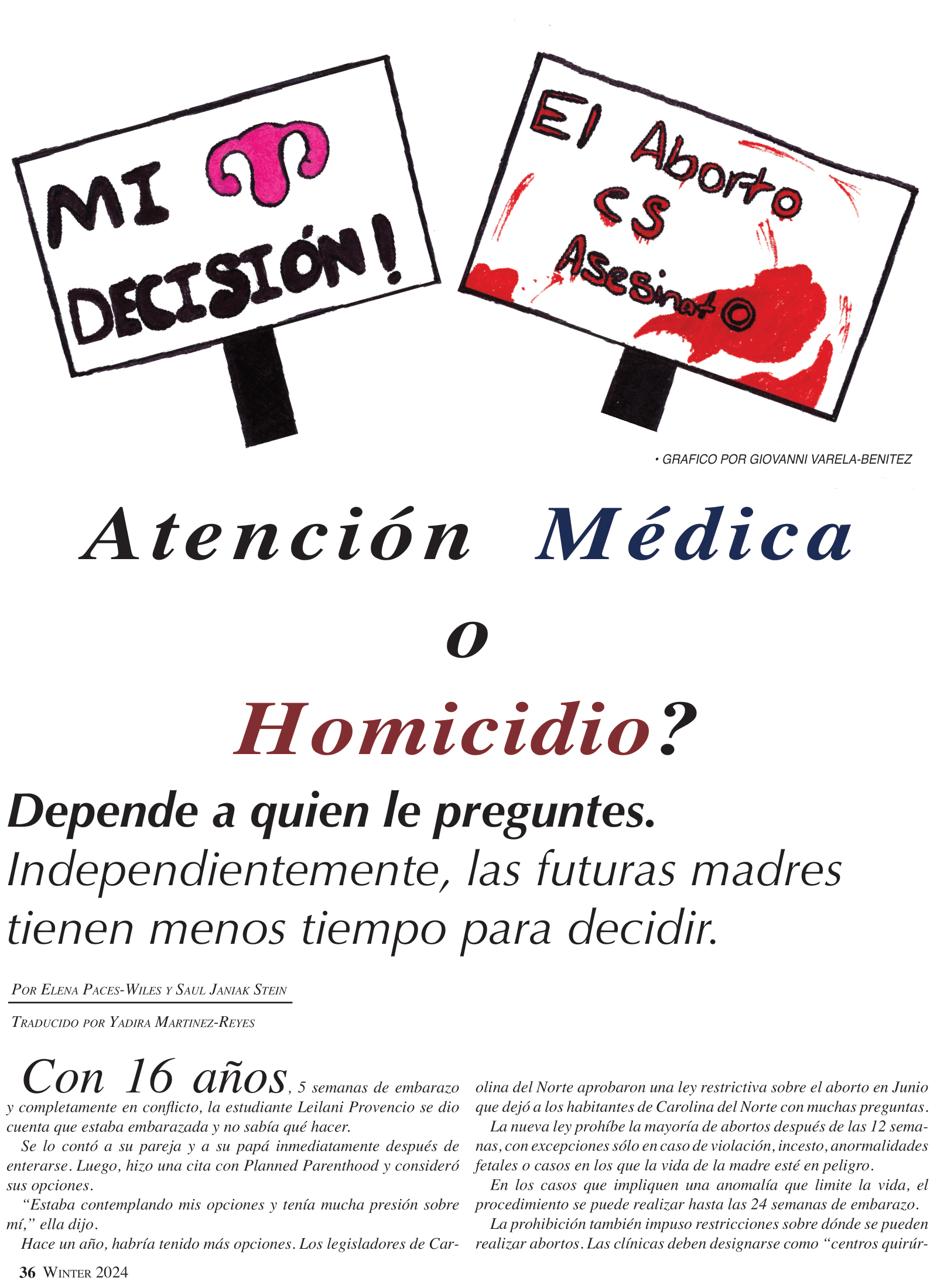
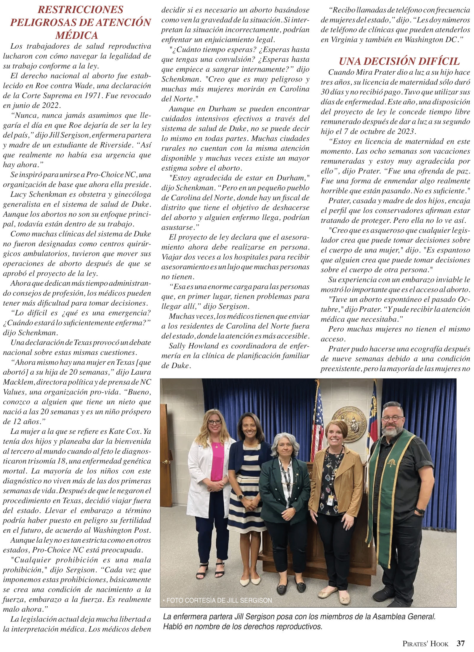
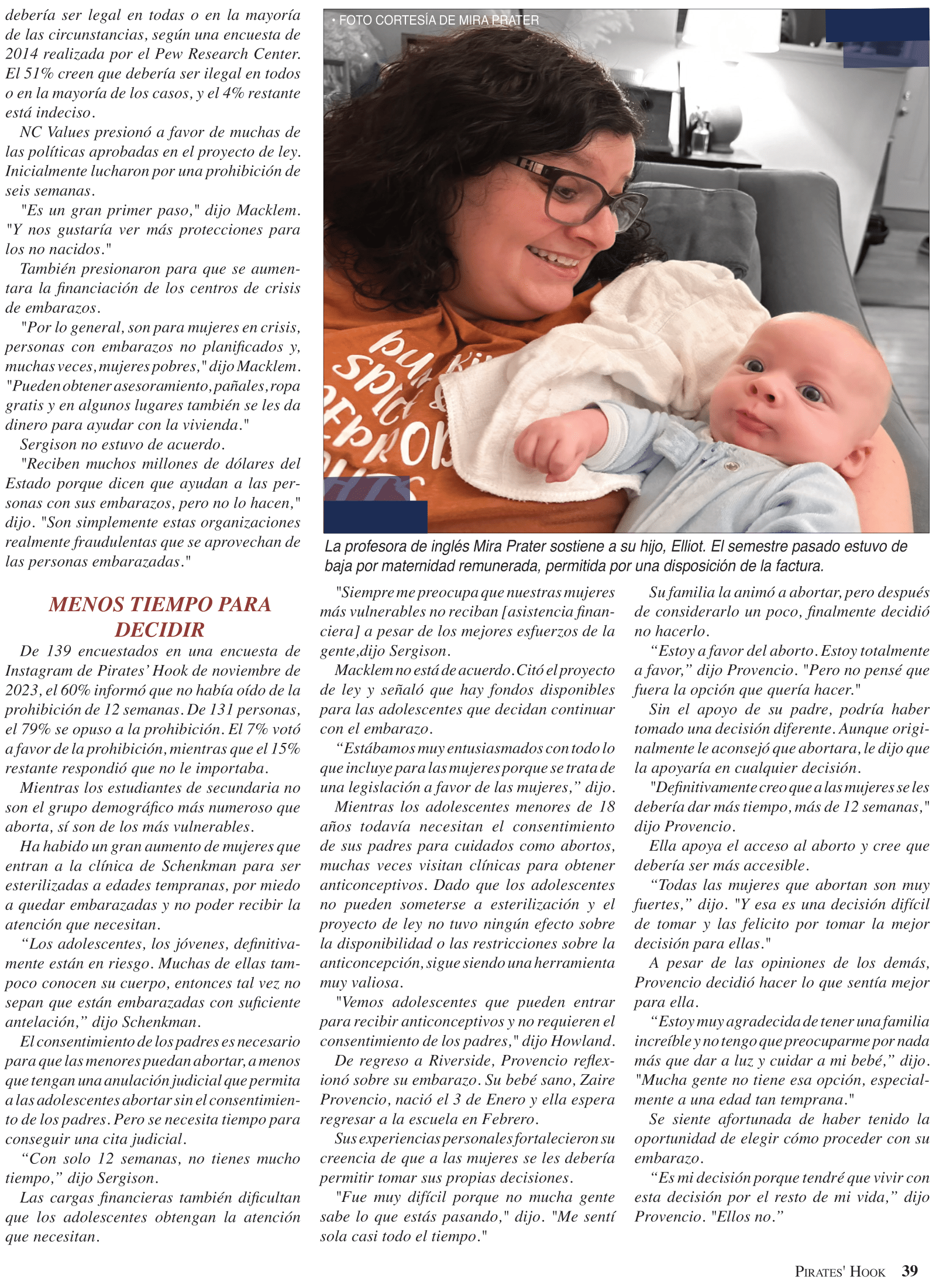
After spending a semester investigating the North Carolina abortion ban, I wanted to design a page that captured the complexity and divisiveness of the issue. I decided to use red and blue to represent the two sides, creating a sense of contrast. I utilized engaging artwork to draw readers and emotion-provoking pull quotes. I also decided to include the full Spanish version in print, doubling my pages. In the past, I used QR codes to link to translations. But when my advisor told me that ESL teacher Jeremiah Safford always uses a class set of newspapers in his classroom, I knew I wanted to include it in print. Designing a cohesive but not redundant eight-page spread was difficult, especially since I don’t speak Spanish. With the assistance of my advisor, bilingual classmates, and staff-artists, I was able to create a design I feel is effective.
As one of the editors, it was my role to finalize the entire paper before we submitted it. With one day until submission, I completely envisioned this spread. I decided to move the sponsors onto this page and to make the shorter stories a column.
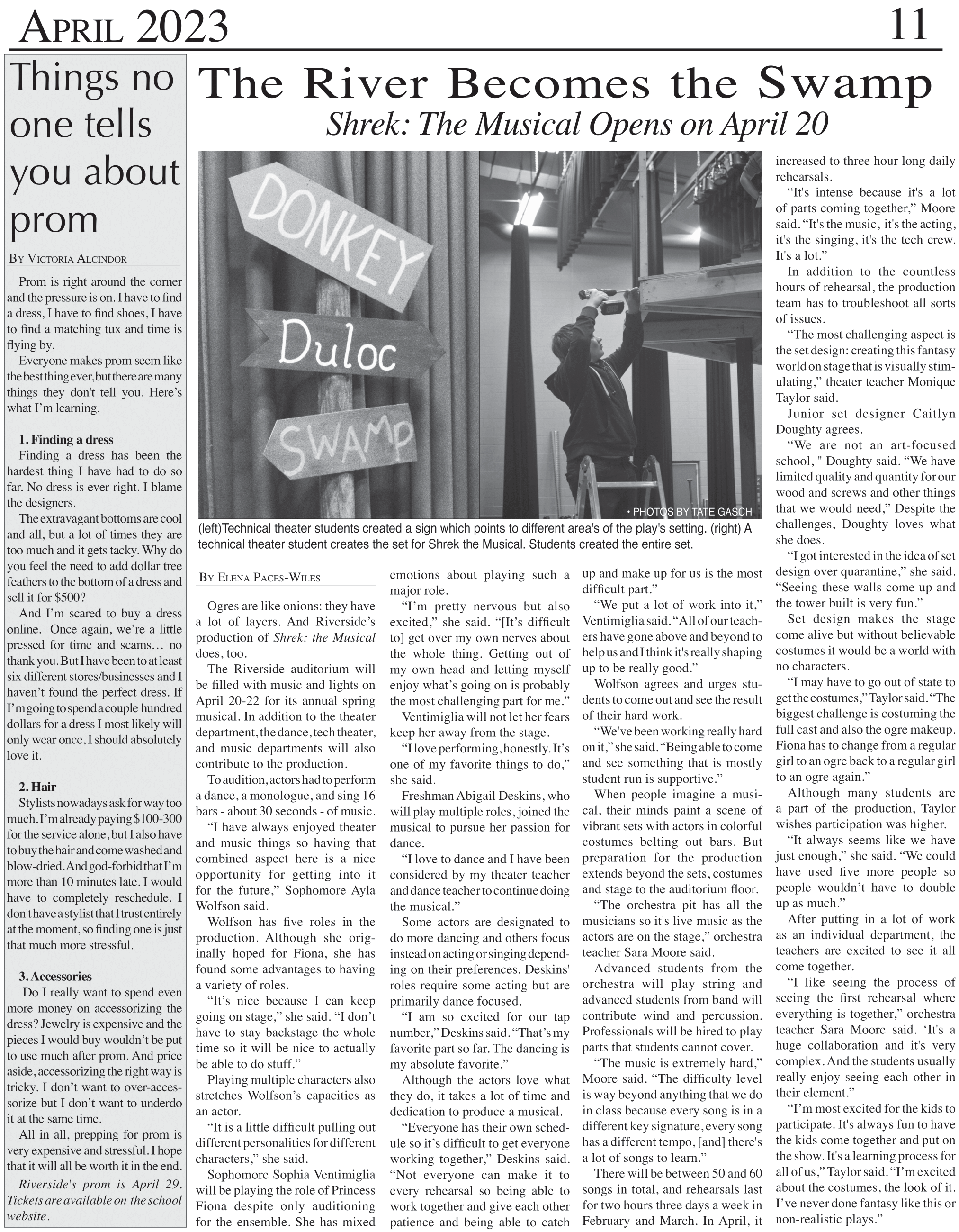
After I finished designing this page for my Shrek: The Musical article, I was told to add a column for my classmate’s prom story. In hindsight, I should have allowed more space for the column.
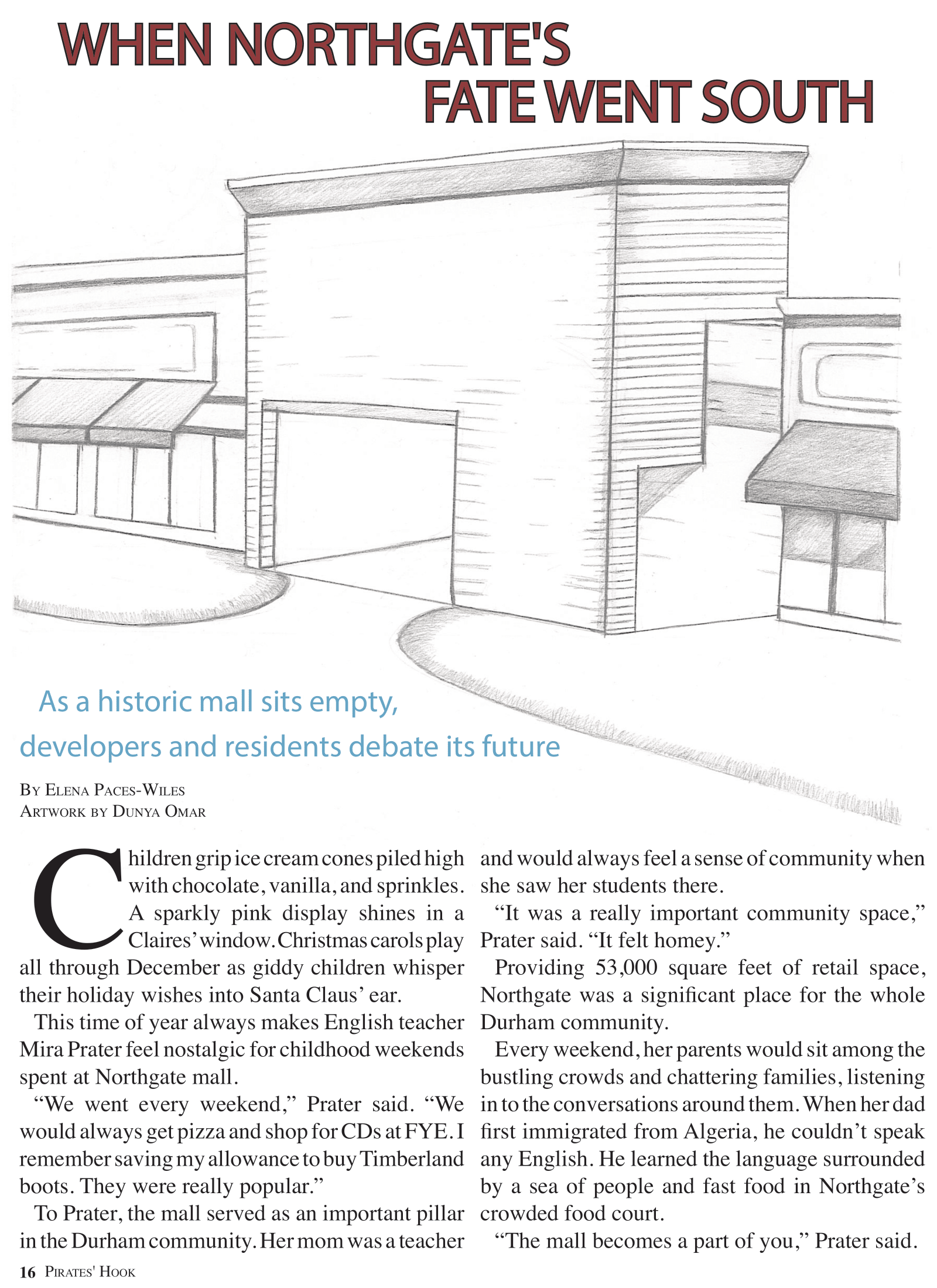
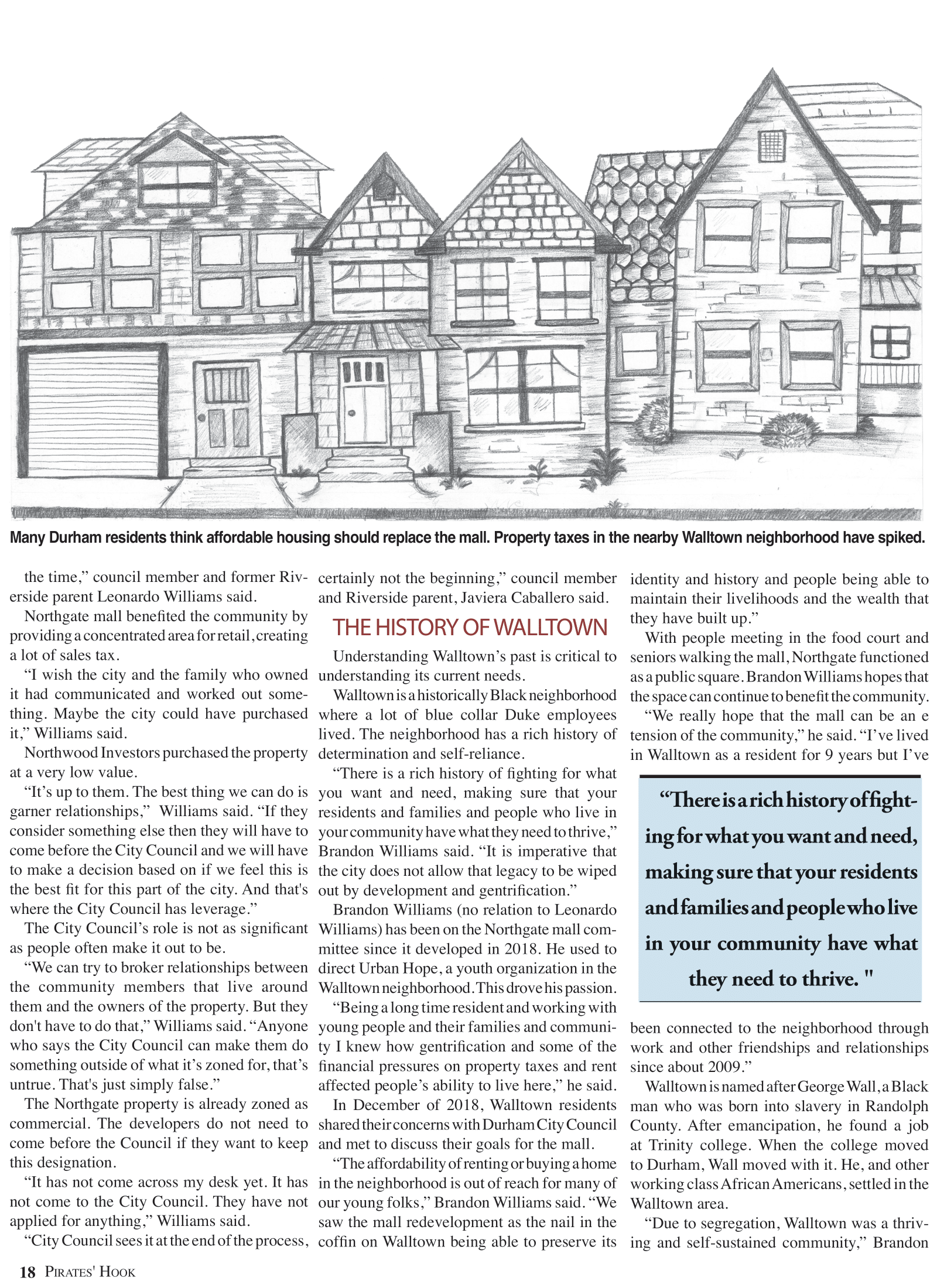
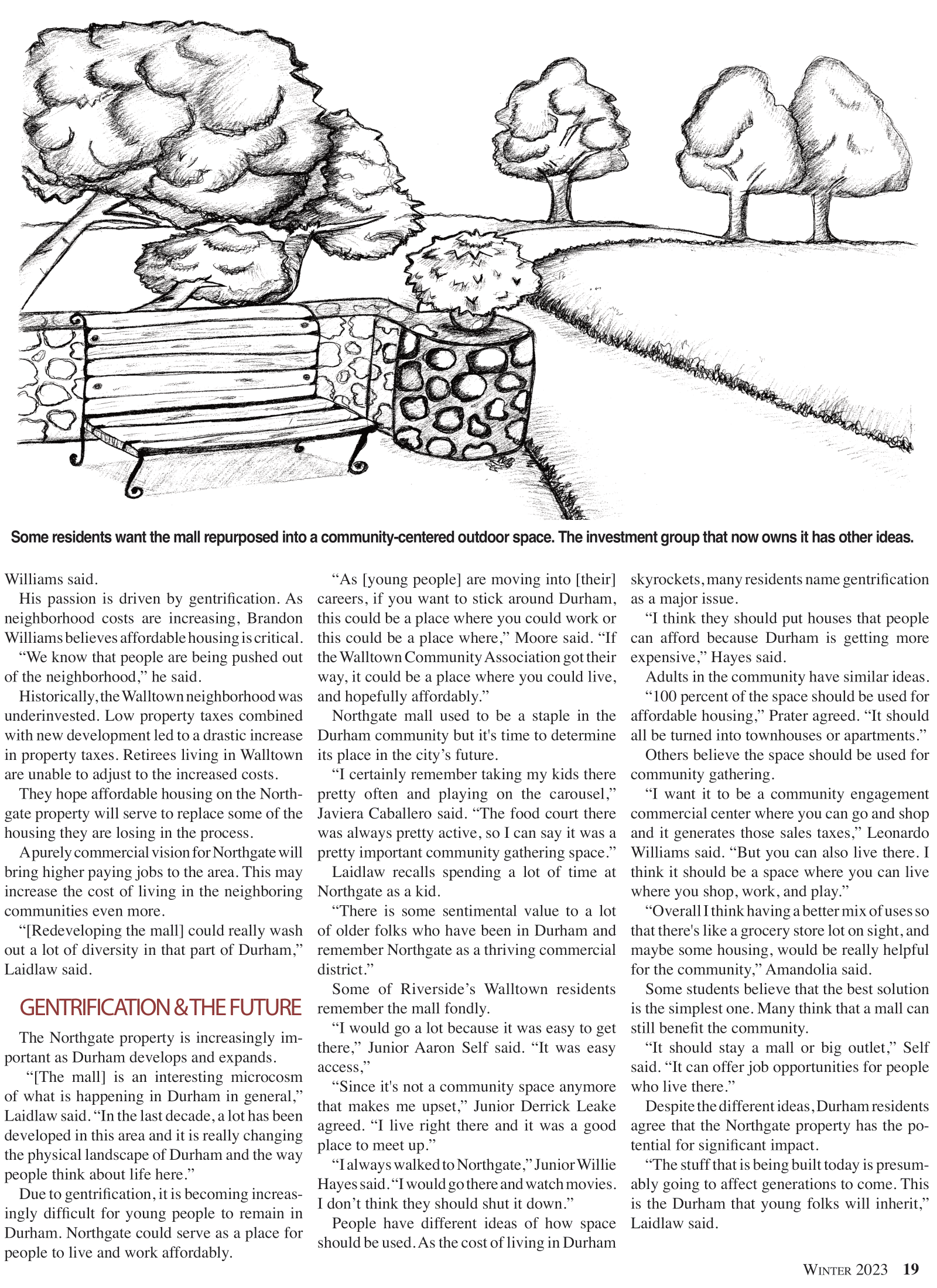
After spending the 2022 fall semester working on my semester-long investigative story, I designed this spread. I worked with an artist to create a page which conveyed the feeling of emptiness in the mall.
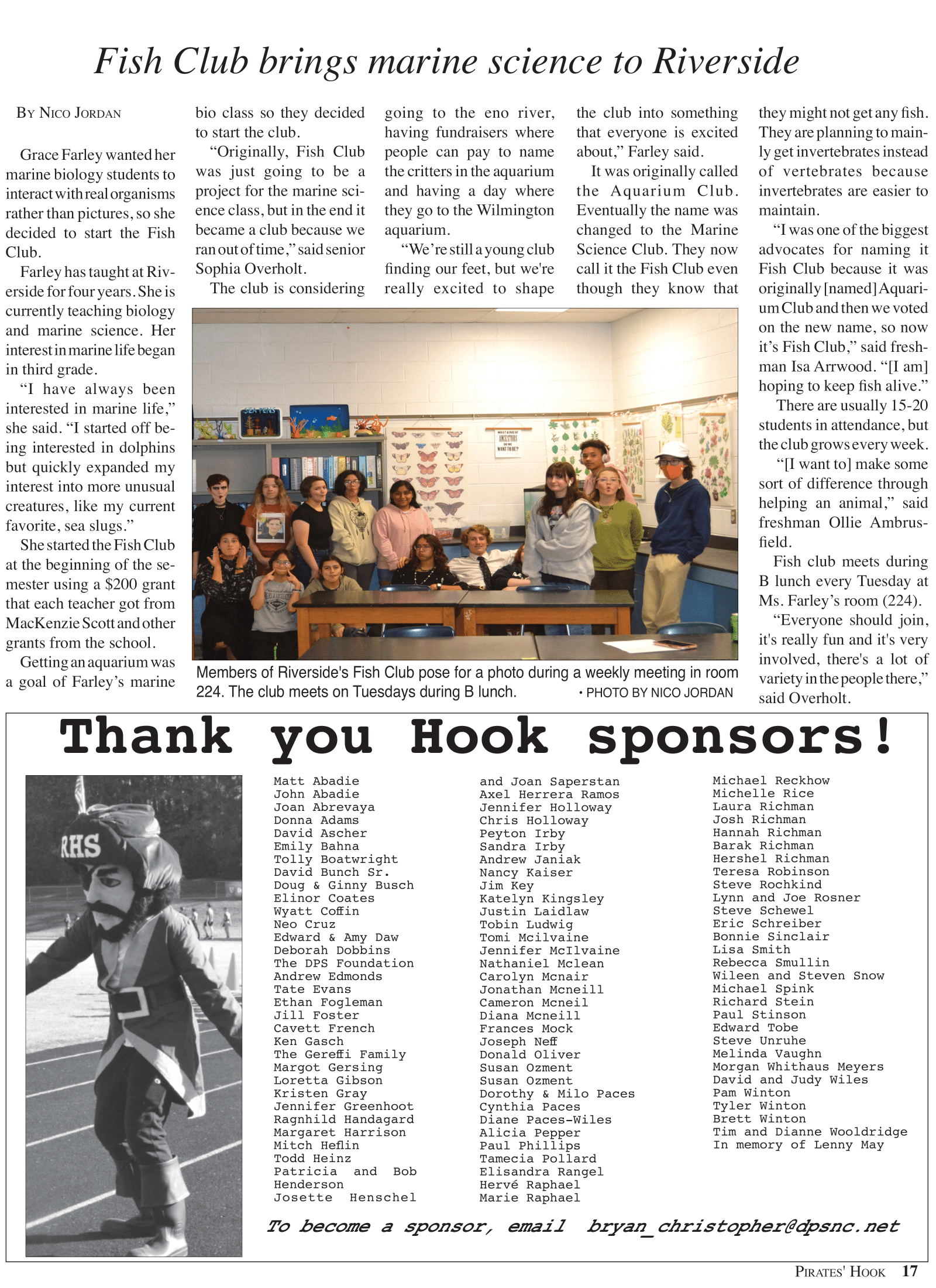
While I also designed a page for my own story in the November 2022 print issue, I learned the most by assisting my classmate in designing their page. I learned how to text-wrap around an irregularly shaped graphic. This taught me that it takes a lot of patience and technical skill to design a page.
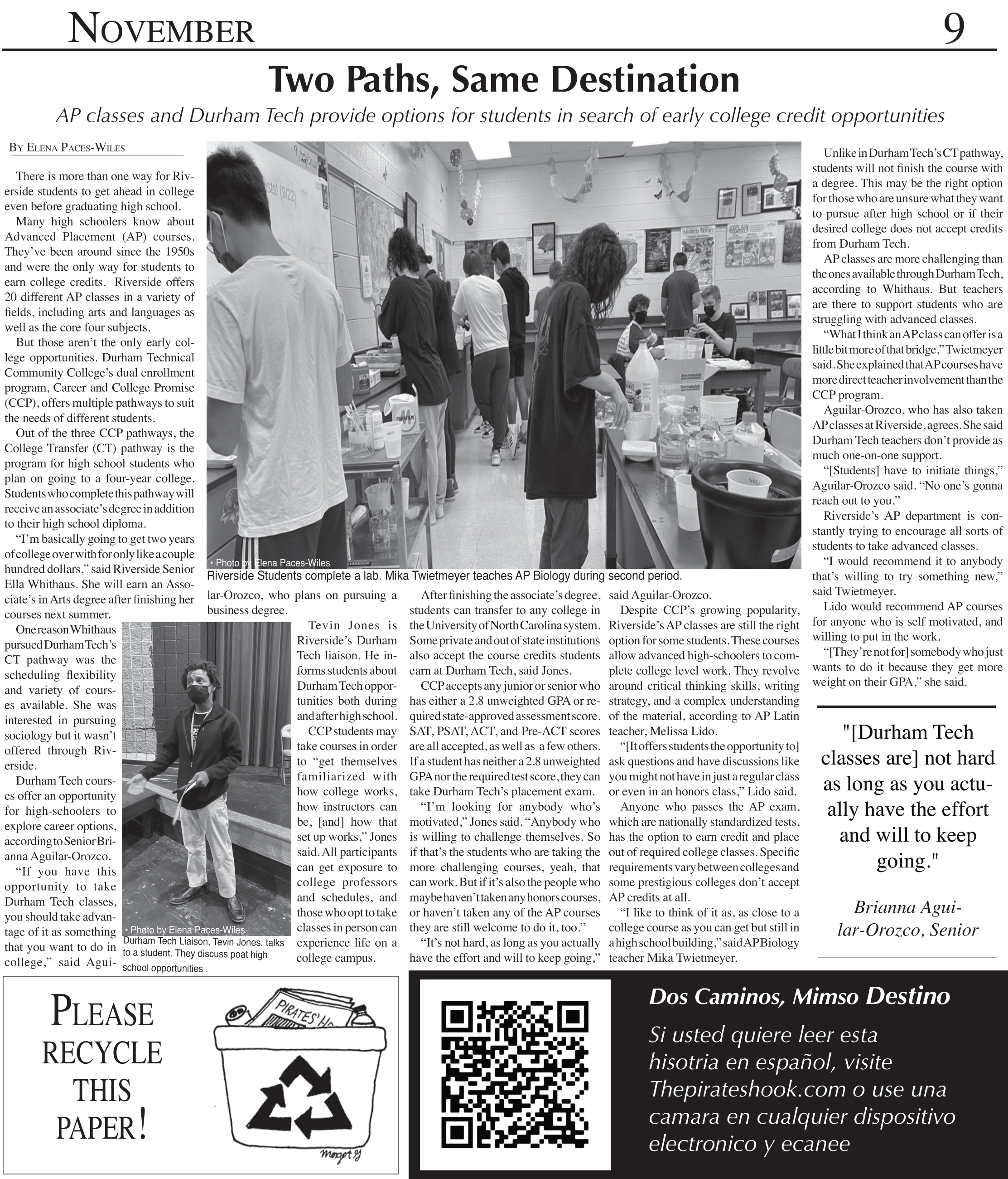
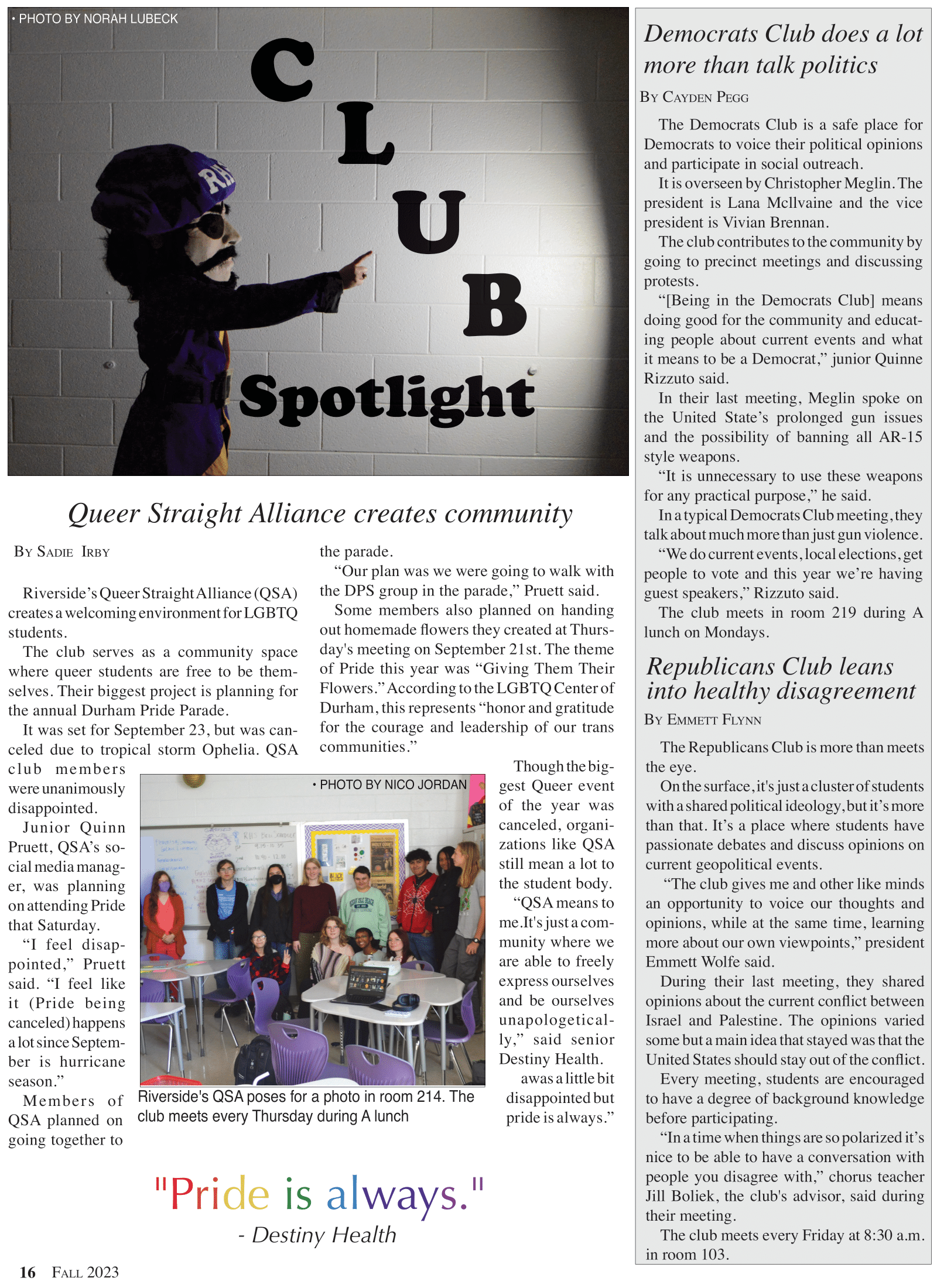
This is the first page I ever designed. Although I would do many things differently now, I am proud of the effort I put into it. Through this story, I learned how to use InDesign to properly align photos and text, and create a sense of cohesion. This spread taught me that proximity matters. The way I organized the visuals created uneven spacing, which interfered with the flow of the story.